Did you have a brat summer?
Did you have a brat summer?
Did you have a brat summer?
Here is how I made a brat birthday invite!
This tutorial is not very brat.
The term “brat” rose to prominence with the release of Charli XCX’s sixth studio album, Brat, on June 7, 2024. Beyond its impact on music, the album ignited a cultural movement and inspired an aesthetic trend known as “brat summer”
Brat album has sparked a Gen-Z driven lifestyle, celebrating confidence, independence, and a hedonistic spirit. This movement is all about embracing flaws and living unapologetically. The “brat” look is marked by bold lime green tones and striking low-resolution font designs.
Before we start.. what is “brat”?
The Brat font for Charli XCX’s album was developed by Special Offer Inc., a creative studio, as a customized adaptation of Dinamo Typefaces’ ABC Rom.
Brent David Freaney of Special Offer Inc. led the album’s cover and typography design. Both the font and the distinctive #8ACE00 color were strategically chosen to feel deliberately “off-trend,” capturing an unpolished, authentic vibe that aligns seamlessly with Charli’s vision.
I didn’t have the customized ABC Rom, so I used Arial and scaled it vertically using scale and rotate tool in Adobe Fresco.
Step 1: font
Upon googling, I found out that the brat color is #8ACE00
Brent David Freaney of Special Offer Inc. led the album’s cover and typography design. Both the font and the distinctive #8ACE00 color were strategically chosen to feel deliberately “off-trend,” capturing an unpolished, authentic vibe that aligns seamlessly with Charli’s vision.
Step 2: color
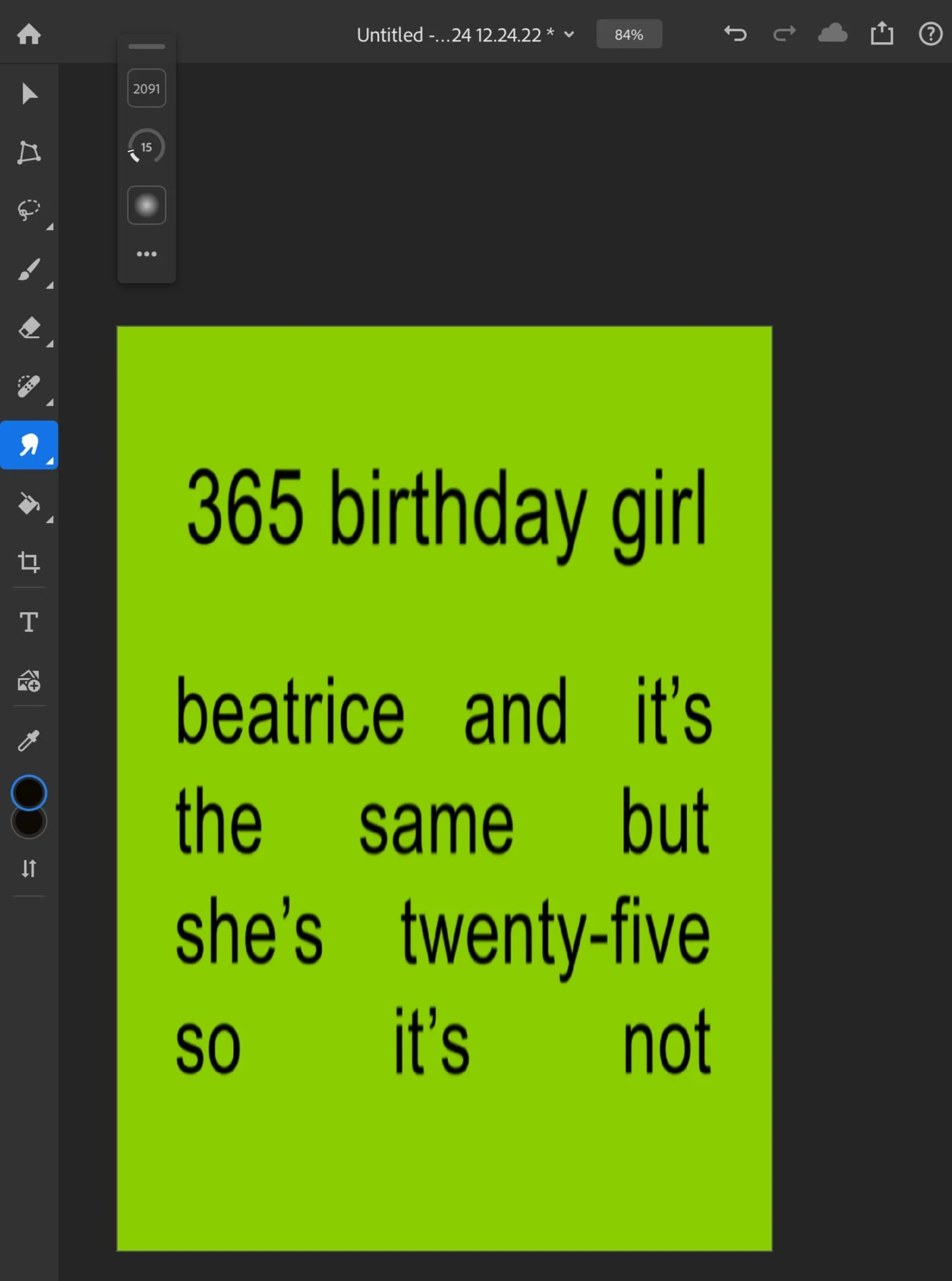
With the font and the color, this was my initial draft of the invitation (right). The design was inspired by Charli XCX’s album brat and it's the same but there's three more songs so it's not (left)
If you look closely, the brat font is blurry. To achieve this blurry look, I exported the image from Adobe Fresco to Adobe Photoshop and used Smudge brush in Adjustment tools.
I used brush size of approximately 2,000, strength 15, and hardness of 9. Instead of painting on each letter, I dragged the smudge brush vertically on each text layer (after flattening it) to achieve the slight blur.
Step 3: blur
Step 4: export
Usually, how to export a file wouldn’t be part of a ‘how-to’ guideline, but here we are.
To achieve a low-resolution look, I export Photoshop file as JPEG, and file size at 0, Low (12 is the Maximum).


